What this is
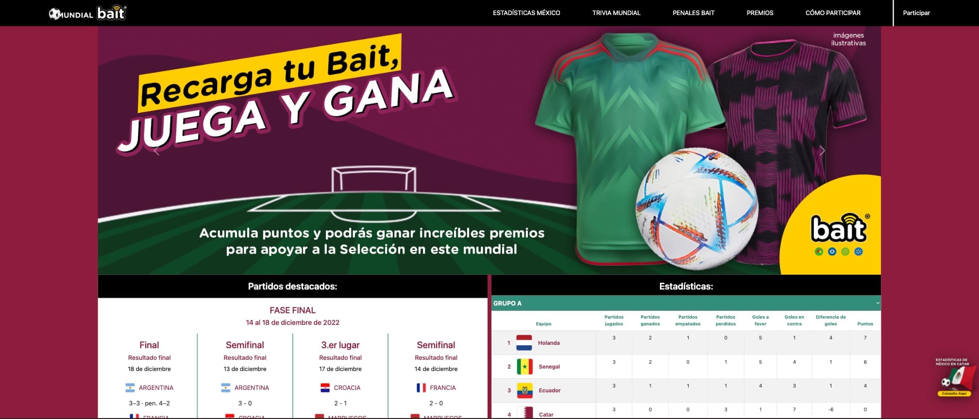
Bait is Walmart de México's mobile carrier, and for the 2022 World Cup it ran a fan-facing campaign built around the tournament. The microsite was where that campaign lived: fixtures, live scores, group standings, and the engagement mechanics attached to the wider promotion, a World Cup trivia and a penalty game, with Mexico's run as the anchor.
I built it at Innovattia, delivering for Walmart and Bait. The UX team handed me a visual sketch of the intended layout and I built the whole interface from it. This was before the AI-assisted tooling that is ordinary in frontend work now; every layout decision, every interaction, every piece of state was written by hand.
What I built
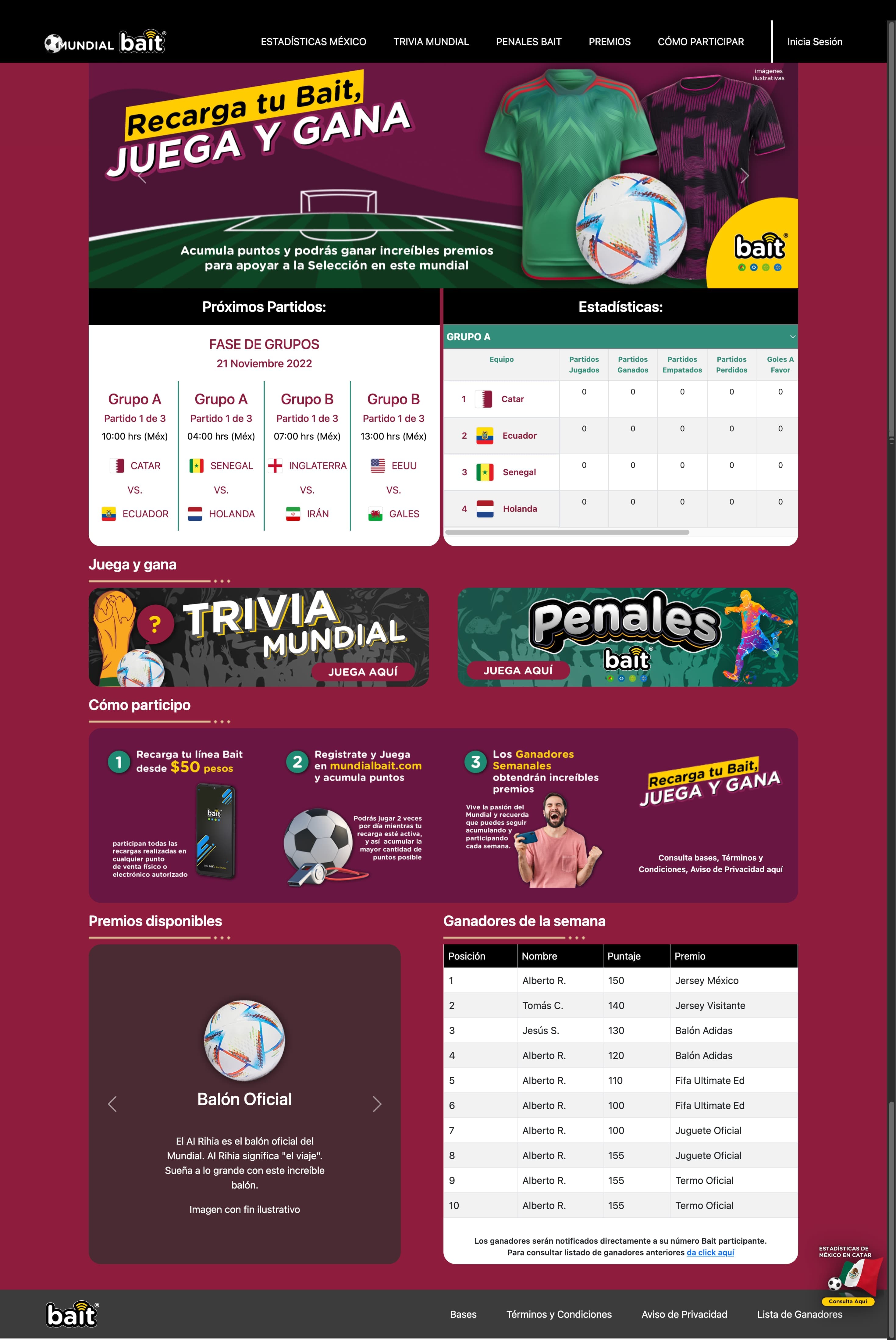
Having no framework and no UI library shaped the whole approach. Component structure had to come out of disciplined markup and class conventions rather than a component model, and every piece of interactivity went through the native DOM API. Nothing was free. Each pattern I would normally reach for had to be built once and then kept consistent by hand, everywhere, by me.
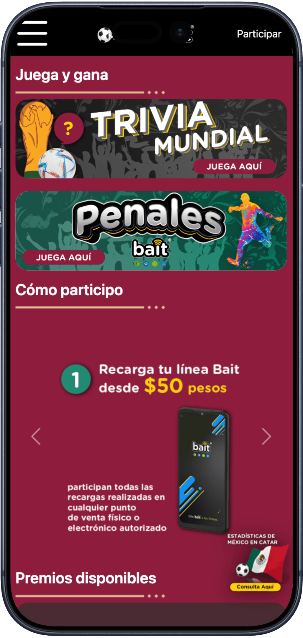
The core surfaces were a fixtures panel for the tournament's headline matches, a statistics view with a per-group standings table, and the campaign entry points into the trivia and penalty games. Scores and standings were rendered into the DOM and updated as the tournament advanced, which is the part that taught me the most: keeping markup, styling and data in agreement is trivial when a framework owns the relationship, and a genuine discipline when nothing does.

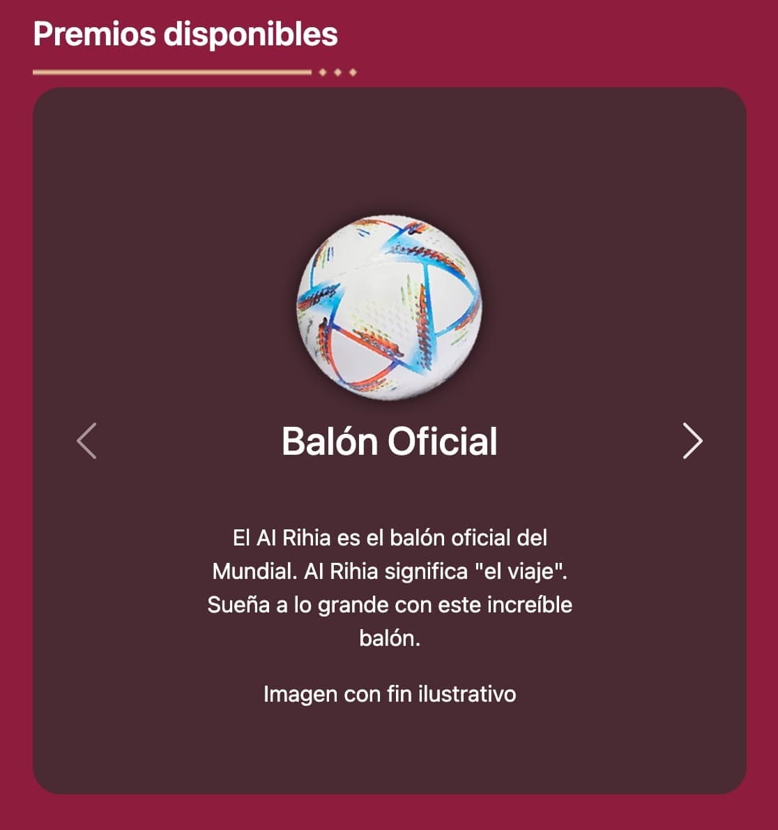
The prizes had a surface of their own: a second carousel cataloguing what was on offer, each item with its name, a short description and the legal disclaimer the campaign required. Two carousels with different content shapes, both hand-rolled; no slider library, just the DOM and the state to track which item was showing.
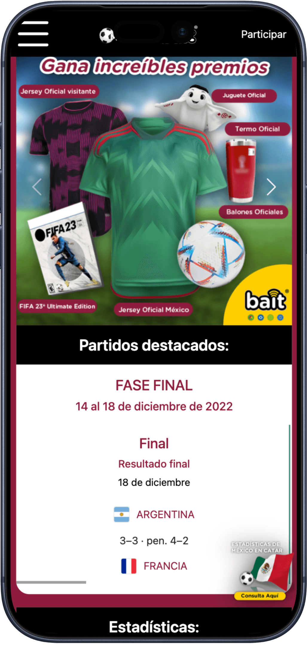
Responsiveness came from the same place as everything else: hand-written media queries. Without a grid system or utility classes to lean on, every breakpoint was a decision about what the layout should become; the game banners going full width, the participation steps turning from a row into a sequence, the fixtures panel giving up its columns. On a campaign that would be opened mostly on phones, that was a large part of the work.
Why it mattered
This was one of my earliest professional projects, and it taught the fundamentals that still hold under any framework: semantic markup, responsive layout, and the discipline of translating a design into a faithful working interface. Building without abstractions makes the underlying mechanics visible. That visibility is what I carried into component-based work at scale, and it is why I can still read what a framework is doing on my behalf.
It is also a project I return to for its symbolism. From one World Cup to the next, it marks a point of departure in a longer journey; I wrote about that distance separately, in From Cup to Cup.
Stack
Vanilla JavaScript, HTML and CSS. No framework, no build-time UI library, no AI assistance. Hand-coded from a UX sketch.