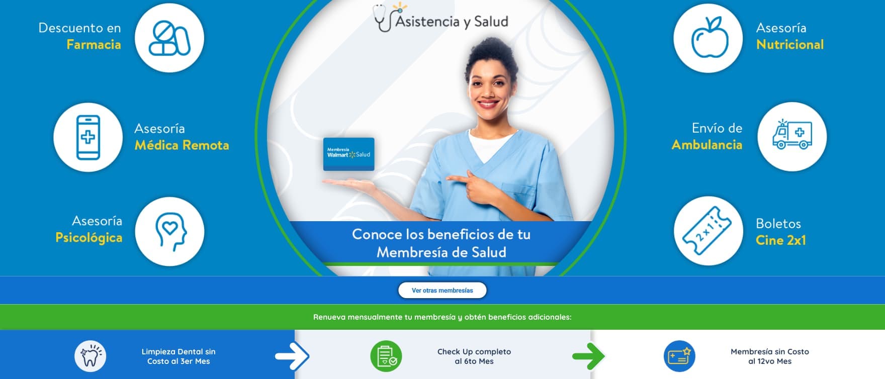
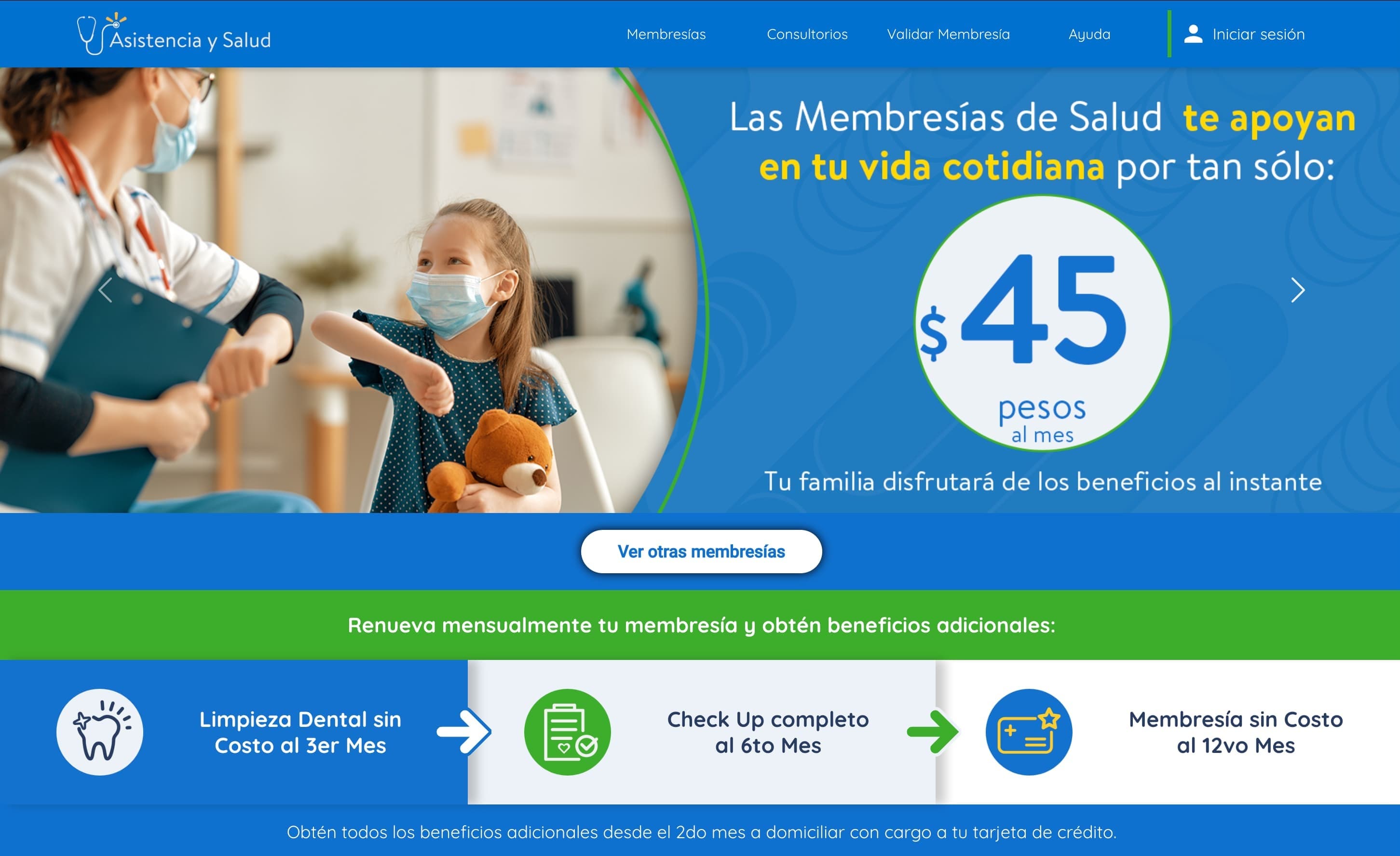
Walmart de México and Bodega Aurrera sell healthcare memberships over the counter: a low monthly fee that buys consultations, dental work, laboratory tests, nutrition and psychological support. At Innovattia I built the frontend of the platform where those memberships are discovered, activated, validated and managed.
The problem
A membership bought at a checkout is not yet a membership anyone can use. It arrives as a folio printed on a receipt, or attached to a BAIT recharge, and from there the holder has three questions, all of them practical: is this still active, where is the nearest clinic that will honour it, and how do I manage my data and the people I have added to it.
Each question has a different source of truth, which is what made this more than a brochure with a login. Activity lives in the membership backend, keyed on a folio the customer often cannot find. Clinics are a directory we own, but people search for them with whatever they happen to remember: a colonia, a postal code, half an address. And beneficiaries are a complete identity record per person, collected from someone sitting alone with a phone rather than across a desk from an agent who can prompt them.
So the information architecture follows the questions rather than the org chart. Three surfaces, in the order a member actually arrives at them.
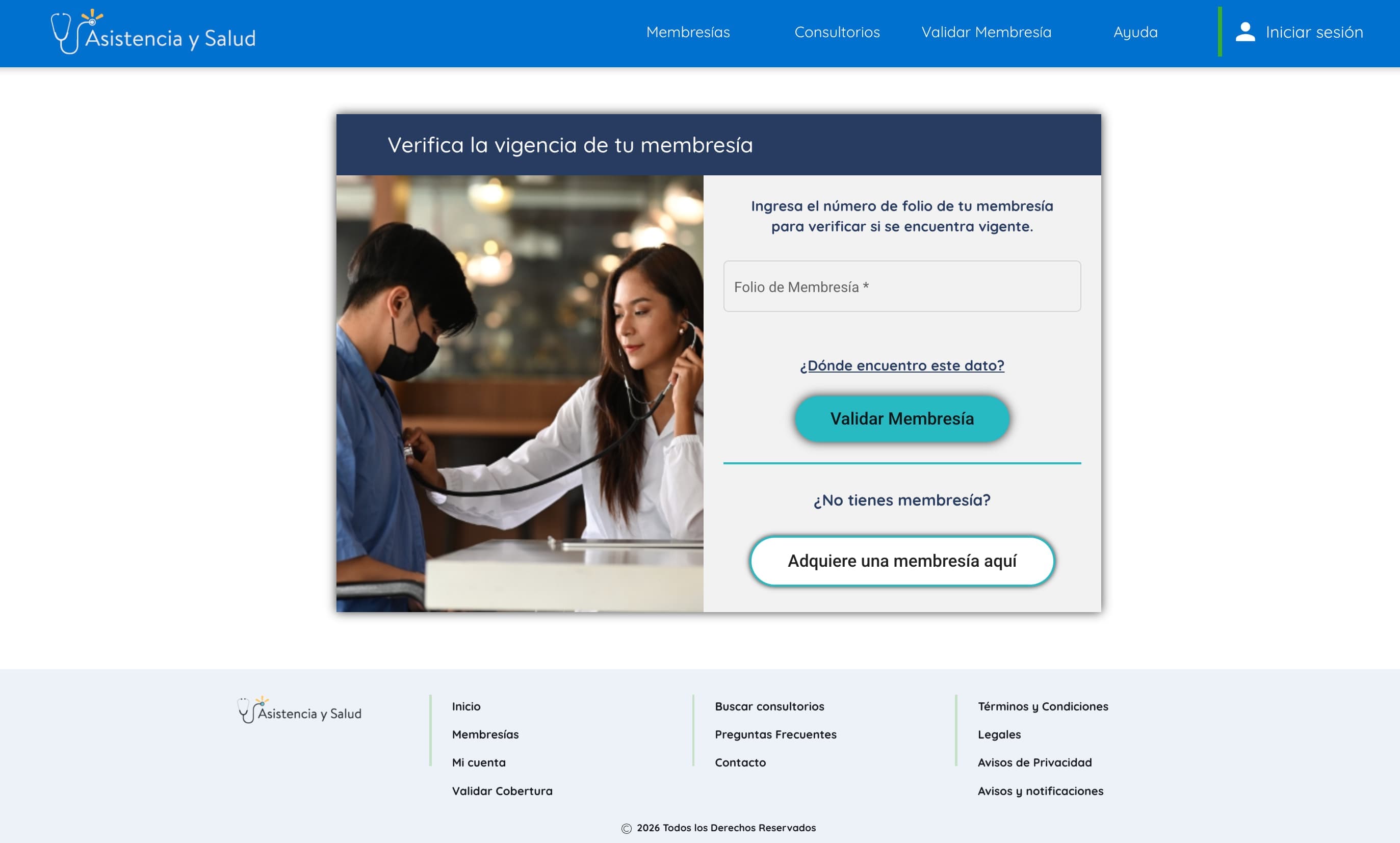
Validating a membership
The first surface answers the folio question and nothing else. One field, a hint for members who do not know where to look for their number, and a direct path into purchase for anyone who arrives without a membership at all. Someone standing in a queue with a receipt in their hand should not have to create an account to find out whether the thing they already paid for works.
Clinic discovery
Search accepts an address, a neighbourhood, a postal code or a city. Google Places absorbs the ambiguity of how people actually type a location, resolving free text into coordinates through its autocomplete predictions; those coordinates go to our own backend, which owns the clinic directory and returns what is in range; the results land on a Google Map beside the list.
The interesting part was never the map. It was the seam between two providers of truth: Places knows about places in general, and only our backend knows which of them are Walmart or Bodega Aurrera clinics with real coverage. Keeping the search forgiving while the answer stayed authoritative was the work.
Member account and self-service
For existing members the account area gathers self-service behind a persistent sidebar: beneficiaries, appointments, privacy and password settings, alongside the member's own personal and membership data.
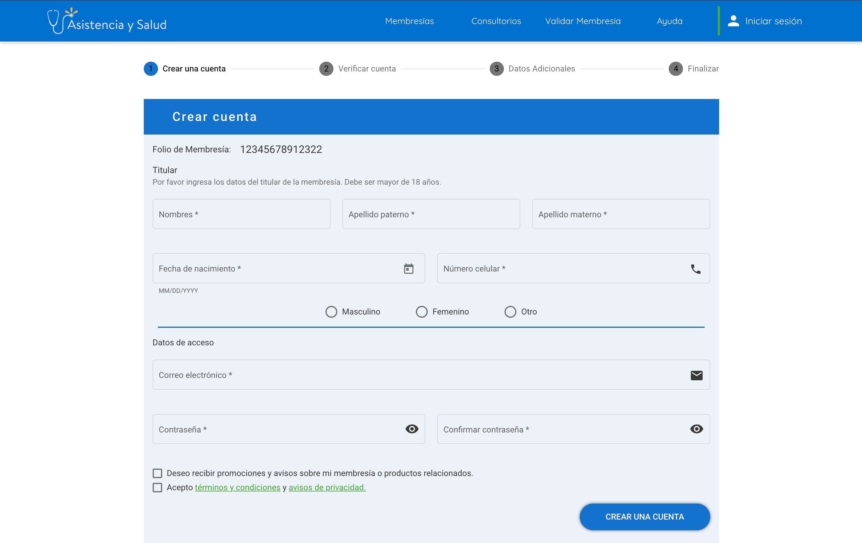
Getting in is a four-step wizard, anchored on the folio throughout: create the account, verify it, complete the additional data, finish. Around it sit the screens that carry the rest of the lifecycle, login, account recovery, password reset and membership activation, each of which has to work for someone who may only visit once a year.
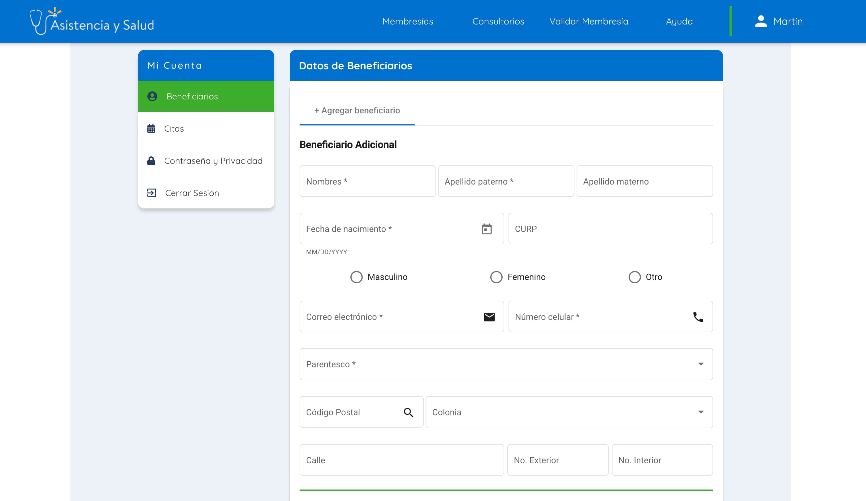
Beneficiary management is the most form-heavy surface in the product, and the clearest case for Reactive Forms in the whole build. Each beneficiary is a full record: personal data, CURP, relationship to the holder, an address resolved from the postal code, and an emergency contact that either inherits the holder's or is registered separately. That last choice branches the form underneath it, so sections appear and begin validating on the strength of an answer given three fields earlier.
Technical notes
Reactive Forms carry the domain. Angular Material supplies the primitives and RxJS drives the API-backed UI states, but the structure that mattered is the form model: conditional sections, cross-field validation, and a shape that mirrors what the backend expects rather than what the layout happens to look like. Where a form branches, it branches in the model first and in the template second.
Payments came in as a module, not as code. Purchase-related functionality was integrated through a local Angular payment library, kept as a reusable module rather than absorbed into the app. Environment-specific configuration separated development and production endpoints, so the same build behaved correctly on either side.
Outcome
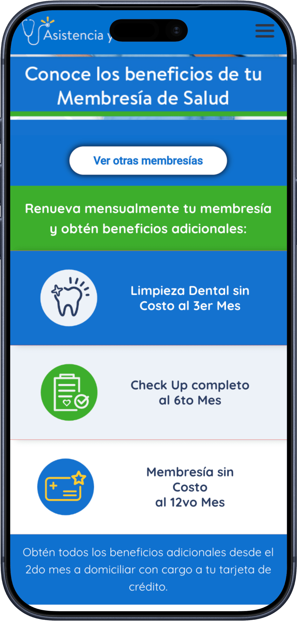
The platform pulled scattered touchpoints into one place: discovering a plan, activating a membership bought at a till, finding care nearby, checking that coverage is still live, and keeping a household's records current over time. Unglamorous work, and the kind that decides whether somebody uses the healthcare they have already paid for.