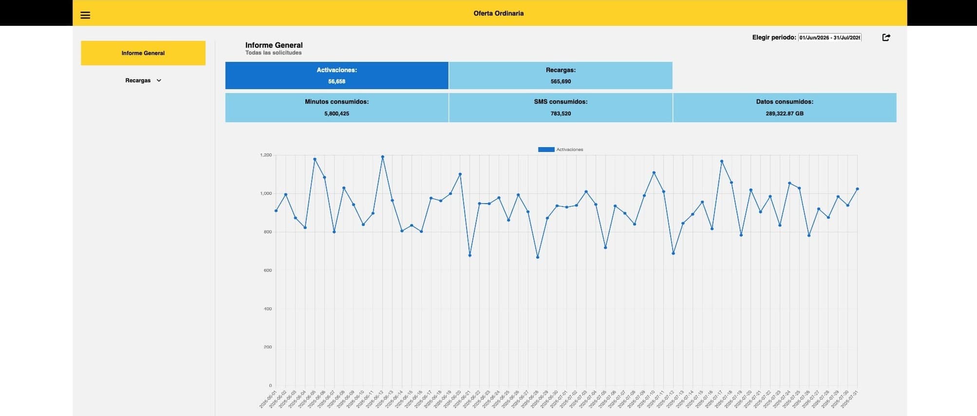
On the visuals in this page. The walkthrough below was recorded from a local demo build running on fictional, generated data. No real customer, commercial or operational information from the company is shown, and the source repository is not published. What I share here are visual renders only, for the purpose of documenting my own work.
Bait is the MVNO operated by Walmart de México. During my time at Innovattia I built the frontend of the internal console its commercial team used to read recharge, activation and network-traffic figures; the reports that until then were assembled by hand.
The problem
Consumption data lived across several backend services, split by offer_id: a catalog
endpoint describing the product tree, a consumption endpoint returning totals per offer,
and a time-series endpoint for charting. Nothing was pre-aggregated. Every question the
commercial team had (how did Sam's Club packages do last week?, which recharge
denomination leads?) meant someone pulling raw rows and pivoting them in a spreadsheet.
What I built
A three-level drill-down, entirely on the client:
- Period summary: ten category cards, each fanning out a parallel request per category and reducing the responses into activations, recharges, offer changes, redemptions, minutes, SMS and data, alongside a ranked top-5 of recharge products.
- Category dashboard: the same figures for a single category, with a Chart.js time series the user re-plots by clicking any metric card.
- Product detail: the series narrowed to one individual recharge offer.
Reports leave the tool in five formats (PDF, XLSX, CSV, XML and TXT) either as a direct download or encoded to base64 and dispatched as an email attachment through the notifications service, with recipients composed in-app.
Technical notes
No framework, no build step. The brief called for something that could be dropped on a static host and maintained by whoever inherited it. It's plain ES modules loaded natively by the browser, with a hand-rolled service layer (request, session, reports, formatting, UI and error handling as separate modules) so the data plumbing stays testable and swappable independently of the DOM code.
Aggregation as the actual work. The interesting part wasn't rendering, it was reconciling the shape of the API with the shape of the report. Categories are described by a nested catalog of subcategories and offers; which metrics a card should even show depends on the product types a category happens to contain. So the rendering is conditional on the category's product mix: a prepaid category shows activations, recharges, minutes, SMS and data; a home-internet one drops minutes and SMS; a ticket-redemption one shows redemptions and data only. Ten categories, each landing on its own branch.
Resilient fan-out. The summary view fires ten concurrent consumption requests and settles them together, so a single failing category degrades that card instead of blanking the page, with API error codes mapped to distinct recovery paths: an empty-result notice, a return to sign-in when the token has expired, and the backend's own message surfaced verbatim when the failure is on its side.
What I would do differently
The category-to-index mapping in the summary view is positional: the code assumes the catalog returns categories in a fixed order, which couples the UI to the backend's sort. A lookup by category name would have cost nothing and removed a whole class of silent breakage. Similarly, the loading state is driven by imperative show/hide calls scattered across the async paths; a single owner for that state would have been sturdier.