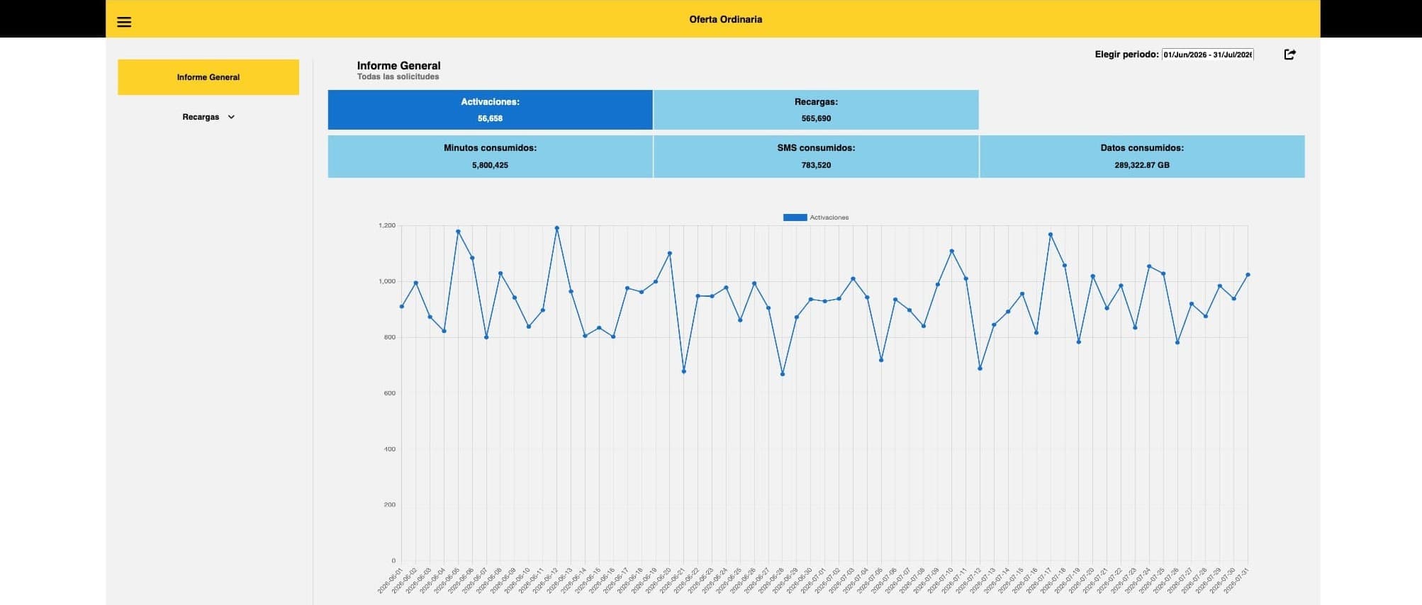
Bait is the MVNO that Walmart de México runs on top of a leased network. In 2022, at Innovattia, I built the frontend of the internal console its commercial team used to read how the product line was performing: how many lines were activated, how many recharges sold, how much traffic customers actually consumed.
Where the data was, and where it wasn't
The backend exposed three endpoints, all keyed on offer_id:
- a catalog returning the product tree: categories, subcategories, and the offers inside them;
- a consumption endpoint returning totals per offer for a date range;
- a chart endpoint returning the same values split by day.
None of them aggregated anything. Asking how did Sam's Club packages do last week? meant knowing which offer ids belonged to that category, requesting them, and adding up the rows yourself. That's exactly what the team was doing, by hand, in spreadsheets.
So the tool's real job was never rendering. It was reconciling the shape of the API with the shape of the report, and doing it in the browser, because there was no aggregation layer to add it to and no budget to build one.
The constraint that shaped everything
The console had to be deployable as static files and maintainable by whoever inherited it, with no guarantee that person would be a frontend specialist. No framework, no build step, no toolchain to keep alive.
I read that less as a limitation than as a spec. It meant plain ES modules loaded natively by the browser, and it meant the interesting logic had to live somewhere other than the DOM code. I split it into a service layer (request, session, reports, number and date formatting, UI feedback, error handling), each a separate module. The DOM files orchestrate; the services do the work. Four years later that boundary is what let me stand the whole thing up again against a mock backend by swapping a single function.
The hardest part: what does a category even show?
Here's the thing that made this more than a fetch-and-render exercise.
Categories aren't uniform. Oferta Ordinaria has activations, recharges, minutes, SMS and data. Internet en Casa has no minutes or SMS; it's a home broadband product. Canjeo de Tickets has neither activations nor recharges; it has redemptions, and data. Which metrics a card should display isn't a property of the report. It's a property of whatever product types that category happens to contain.
And the catalog doesn't say so directly. It describes a nested tree of subcategories, each holding offers, each offer carrying a product-type code. The only way to know a category has minutes is to walk its subcategories, classify each one by name, collect the product types of the offers inside, and deduplicate.
That classification is the seam where everything meets. Subcategory names are matched by pattern (activations, recharges, redemptions, offer changes) and only offers under a matched subcategory contribute their product types. Traffic offers therefore have to hang off the event subcategory that generates them, which is a modelling decision baked into the catalog itself, not something the frontend chose.
The result is a card renderer that branches on the category's product mix rather than on its name. Ten categories, each landing on its own branch, with no per-category special casing in the layout code.
Failing one category instead of the page
The summary view fires ten concurrent consumption requests, one per category. Settling them together rather than racing them means a single slow or failing category degrades its own card instead of blanking the report.
The backend's error codes map to genuinely different recovery paths, and I kept them distinct rather than collapsing them into a generic failure:
- no results for the parameters: a message, nothing else to do;
- expired token: clear the view, tell the user, send them back to sign-in;
- internal error: surface the backend's own message so support has something to act on.
The distinction matters more in an internal tool than in a consumer one. The people hitting these errors are the same people who will report them, and "something went wrong" wastes everybody's afternoon.
Getting the numbers out of the browser
A report nobody can forward isn't finished. Reports leave in five formats (PDF, XLSX, CSV, XML and TXT) through one path with two endings: generate the file and download it, or generate it, encode it to base64, and hand it to the notifications service as an email attachment, with recipients composed in the app and validated before sending.
Two report shapes cover what the team actually asked for: traffic (minutes, SMS, data) and events (activations, recharges, offer changes, redemptions), each rendered with placeholders where a category doesn't carry that metric, so a spreadsheet column never silently reads zero when the truth is not applicable.
Revisiting it in 2026
To show this work without exposing company data, I rebuilt the backend as a local mock layer: same response contracts, same field names, generated figures with weekly seasonality and a seeded PRNG so a given date range always produces identical numbers and a screenshot stays reproducible. Every figure in the walkthrough is fictional. No customer, commercial or operational data from the company appears anywhere, and the source repository isn't published.
Running the whole flow again end to end surfaced four latent defects that the original backend's timing had been hiding:
- A loading overlay that stayed open when the top-products request happened to settle last; a race the real network usually won, but only usually.
- A category menu that duplicated its entries once you changed the date range before drilling in, because the array backing it accumulated across renders instead of being rebuilt.
- Date strings reaching the data layer with leading whitespace, from splitting a composite key, which silently changed how they parsed.
- A licensed font with no fallback, so the sign-in screen dropped to a serif nobody chose.
None of these were visible in normal use. All of them were one line away from not existing. That's the part I'd take to the next project: the bugs that survive are the ones whose symptoms depend on timing you don't control.
What I would do differently
The positional coupling. The summary view addresses categories by index, assuming the catalog returns them in a fixed order. It works, and it's brittle in a way that fails silently: reorder the catalog server-side and every card shows the wrong data with no error anywhere. A lookup by category name would have cost nothing.
Ownership of the loading state. Show and hide are called imperatively from several async paths that don't know about each other. That's precisely why the overlay could strand itself. A single owner (a counter, or a state machine) makes the whole class of bug unrepresentable rather than merely fixed.
The aggregation belongs on the server. Doing it client-side was the right call for the constraints I had, not the right architecture. Every consumer of this data has to reimplement the same reconciliation, and the browser is downloading far more rows than the report actually shows.